Put your mark
in the right place.
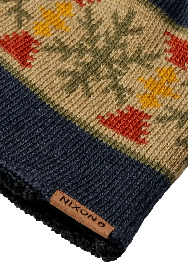
A knitted logo, embroidery, a woven tab or a sewn patch each changes the finish. Review the method and placement on your chosen knit.
 Design study
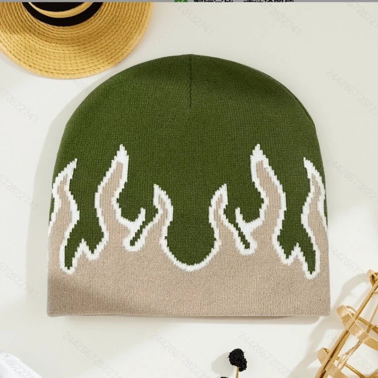
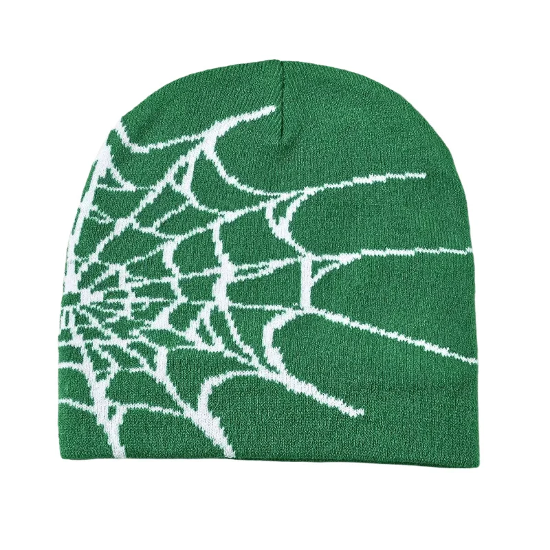
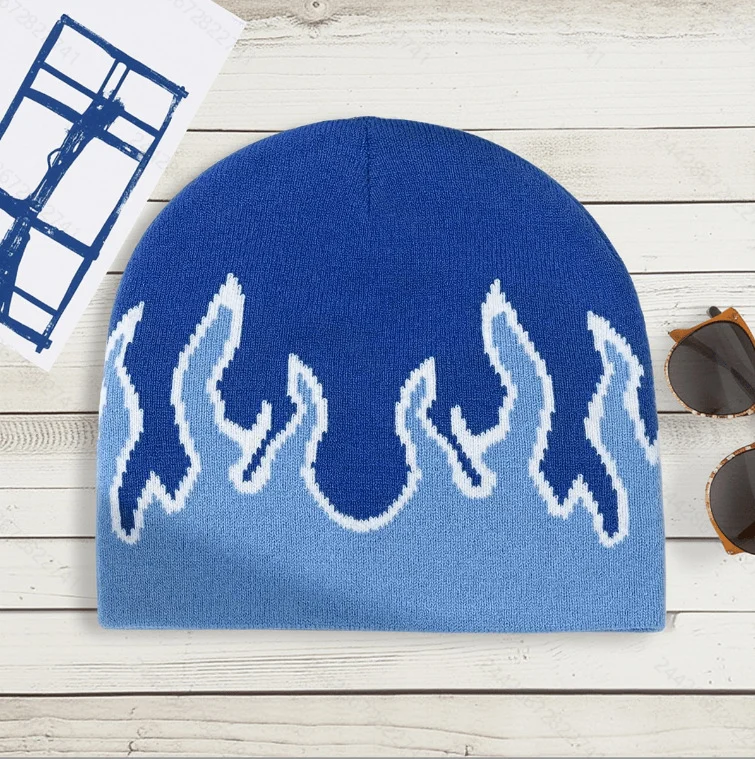
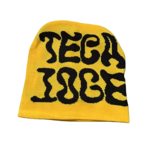
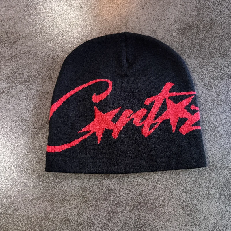
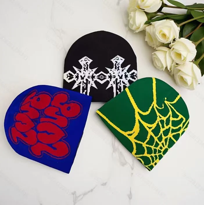
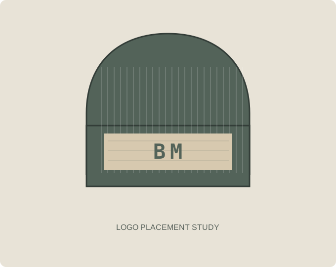
Knitted-in artwork
Build the motif into the knit.
What to review
A logo, wordmark or repeating pattern is formed with contrasting yarn colours. Review the artwork at the stitch scale: narrow gaps, fine lettering and colour changes need to work in the knitted grid.
Approve the knitted artwork, colour contrast and its position with the cuff folded.
 Design study
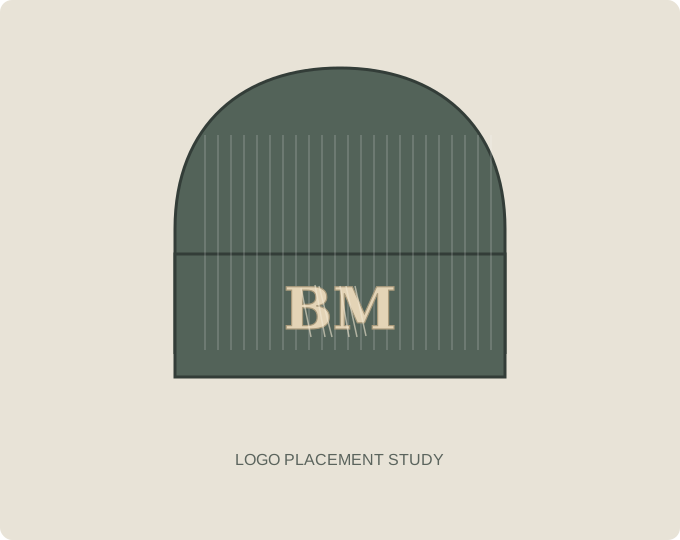
Embroidery
Put the mark on the finished surface.
What to review
Embroidery gives a separate thread finish to a wordmark or symbol. On a stretchy beanie, design size, backing and stitch coverage need to be reviewed together so the decorated area sits comfortably.
Check the finished logo on the actual knit, both relaxed and worn.
 Design study
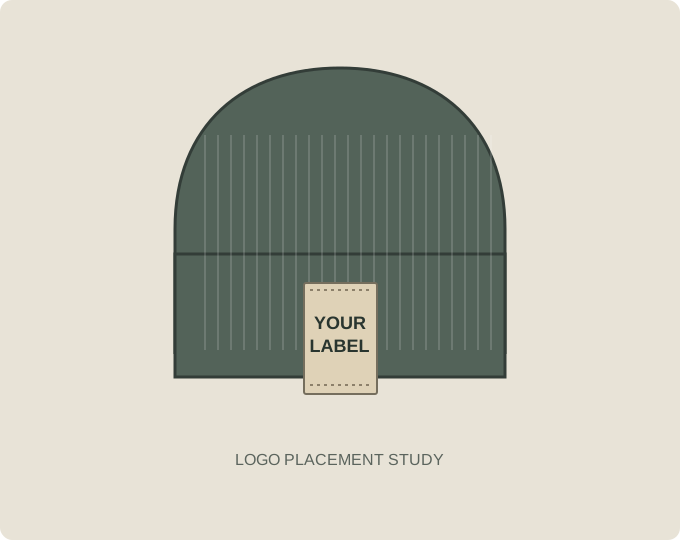
Woven labels
Use a small, clearly placed brand tab.
What to review
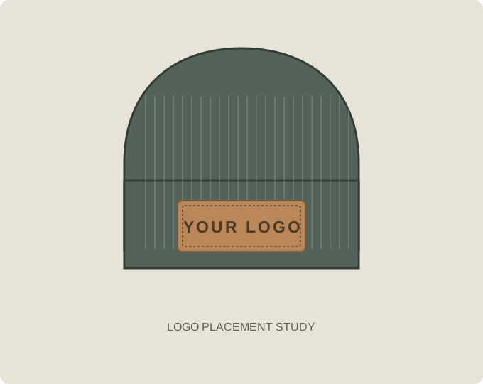
A woven label can sit on the front, side or cuff edge. Its finished dimensions, fold, attachment and reading direction matter as much as the artwork—especially when the cuff turns up.
Confirm which side faces out and whether the label is visible with the cuff up or down.
 Design study
Sewn patches
Give the logo its own surface.
What to review
A patch separates the mark from the knitted texture. Discuss the desired material, edge finish, size and attachment before sampling; a large rigid patch can change how the cuff stretches.
Approve patch material and edge detail, then check the attachment on a worn sample.
Illustrations show possible logo positions. Final artwork, dimensions, method and availability are reviewed for each project.
A colourway starts
with a conversation.
Bring a physical swatch or a named colour reference. We can discuss existing shades and custom colour development against the chosen yarn and quantity.
Pick a direction.
These eight digital concepts help compare directions; our real colour-card photographs are shown above. Screen appearance is not a guaranteed dye match.
- ReferenceIdentify body, cuff, artwork and trim colours separately.
- Physical reviewCompare the yarn or knitted swatch in agreed lighting.
- Sample approvalApprove the complete colourway on the actual hat.
Material and dye minimums are confirmed for the project.
Give the logo a finished position
Show the intended location on a worn view or a measured sketch. For a cuff label, specify whether the artwork should face out when the cuff is turned up, down or both. For embroidery, check the decorated area against the beanie’s stretch.
Send a vector file when available. A PDF, AI, EPS or SVG helps define the edges and lettering; a clear image can start the discussion if the final artwork is not ready. Keep the artwork revision and dimensions together.
Before the decoration sample
| Check | Why it matters |
|---|---|
| Final size and orientation | A readable flat mockup can become cramped on a narrow cuff |
| Cuff fold and seam positions | They determine where the logo actually appears |
| Artwork detail | Fine gaps and thin letters may need adjustment for the method |
| Colour references | Yarn, embroidery thread and label colours are separate approvals |
| Attachment and reverse side | Comfort and stretch need review as well as the front appearance |